by Salvador Plascencia, 2005
245pp
Read: 1/11/07 - 1/19/07
Perhaps the most typographically unique book I've ever read. (If you are inclined to check out this book on the basis of the foregoing sentence alone, congratulations: we'd probably make great pals. The bad news is you've chosen a hopeless life of form over content, and are doomed to pursue an increasingly empty series of "experiments" in style, and will probably die without ever knowing true love, or any sentiment for that matter. I blame late 20th Cent society, myself.) Not that the font is at all unusual--it seems to be the same as any McSweeney's book I've ever read (Garamond Three)--but the layout of the text is stylized. The book's chapters fall into three basic types (which the table of contents quasi-helpfully designates through a system of dots and dashes): those which follow a single character's first person narration, and which are laid out in a completely traditional manner; those which alternate among the third person narration of three given characters, again with traditional text arrangement; and those which follow any number of characters.
This last type of chapter is easily identified if you happened to flip through the book: on the verso you will see one wide column under the label "SATURN," this tells the action through an omniscient narrator. Essentially. On the recto, you see two narrow columns. The left column is labeled "LITTLE MERCED" and tells the action through the first person narration of the character of that name. The right column is reserved for first person narration from any one of the book's other characters; even unnamed, seemingly background characters are given voice.
Having laid out the book's ground rules, Plascencia of course breaks them by the novel's end. In the last chapter as many as six columns (or stubs of columns) crowd the page, and they are sometimes oriented perpendicular to the page (ie, sentences run bottom-to-top). I think this last gimmick is meant to resemble troops in battle formations.
There are other, less egregious devices employed: multiple dedication & title pages; words that seem to be scratched out & whole passages obscured by large black blobs (which themselves reflect a theme of occlusion, which is also part of the story); and **SPOILER ALERT** page 139, which contains only a single italicized word, "cunt".
But before the author can even play these stylistic games, there's the pesky task of coming up with a plot, right? The story here is such that I actually found myself wishing that Plascencia'd just delivered up a "straight" narrative about these people & their lives, without all the pomo hoo-ha. (I find myself wishing that about a lot of books.) People of Paper concerns a community of Mexican immigrants united by a benign street gang and a bizarre quasi-Catholic brand of mysticism (E.g., "When a saint dies, the smell of popourri extends out to a five-mile radius."). Also, there are mechanical tortoises. Federico de la Fe, the disconsolate father of Little Merced, convinces the local flower pickers and cholos to make war on Saturn, which he claims is a tyrant and voyeur, and the reason his wife left him. The gang's "war" involves efforts to hide their lives and inner thoughts from the ringed planet. And then the metafiction kicks in.
And just as the tricks played with form are justified by their relationship with the text's content, Plascencia's metafictional acrobatics are redeemed by virtue of their raw emotional content. The author's own emotional frustrations propel the book's creation. There's actually a surprising amount of sentiment for such willfully experimental fiction. Sadness, and escaping it through futile & unhealthy means is ultimately one of the book's major themes.
Speaking of themes, I feel like I would maybe benefit from a methodical re-read. The book is rife with images and themes that scream for cataloguing and cross-indexing. If I were teaching this book to a bunch of high schoolers, I'd create a worksheet, a kind of literary device matrix. The rows would be named for the various characters, and across the top would be "honeybees," "blood," "foreskin," "flowers," "paper," "Napoleon," "lime," "Oaxacan songbirds," "self-mutilation," "cold climates," "celebrity," "colonialism," etc. Bright young kids could make note of what character encounters what theme/image on what page, maybe copying the relevant sentence, and there you'd have the book's scheme.
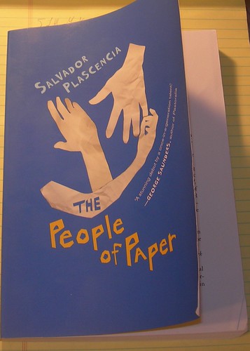
This was originally published as part of McSweeney's "Rectangular" series, before I began to read those books as soon as they come out. Purchasing this at Borders, I had a choice between the handsome hardback McSweeney's first edition, and the cheaper paperback edition recently put out by Harcourt. If you've ever witnessed me standing before the wall of yogurt at the grocery store, using a spiral-bound notebook to calculate exactly which brand costs least per ounce that particular week, you've probably guessed which edition I ended up buying. Oddly, this choice actually affects the body of the book: the author is at one point accused of selling his personal experiences for "fourteen dollars and the vanity of your name on the book cover." I suppose the text originally said "twenty-two ninety-five and the vanity..."
No comments:
Post a Comment